Don't make any sudden moves.
Anyway, I decided to revisit the task of creating a banner for my Etsy shop in the hopes that this time I would rise victorious.
Personally, I'm a fan of Photoshop. It's an amazing tool, and you can do some really cool stuff with it. Unfortunately, you have to mortgage your house in order to buy a copy.
 So I use a free program called Gimp. Get your copy here. It's a lot like Photoshop, but less predictive. Good news if you get upset with programs that say, "It looks like you're trying to do blah, here I'll do it for you," (I hate that paperclip guy), not so good news if you get irritated with yourself for not being able to just MAKE THE STUPID THING WORK!!
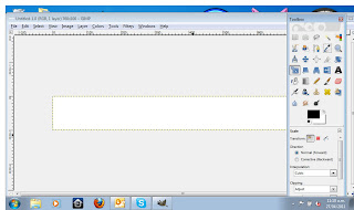
 So we start simply by opening a new image, 760 pixels wide by 100 pixels high (because that's what Etsy says it needs to be). I set the resolution at 150 pixels per inch simply because that seems like a nice number.
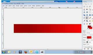
I also like gradients, so, select the colors you want, select the gradient tool, and ...
 Voila! There's lots of settings and stuff in there you can play with until you get it looking just how you want.
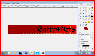
 Of course, you need the name of the shop. Selecting the text tool will open the dialogue box where you type what you want the text to say. In my case "Batty4Arts" since that's the name of the shop.
Putting the name of your shop on your banner. Stroke of genius!
 You can also play around with the font styles, size, color, etc. I get most of my fonts from DaFont. They have tons of free use fonts on there that are so much fun. I can spend hours, days, weeks... you get the picture, downloading fonts just because.
 So this is the banner. Kinda boring.
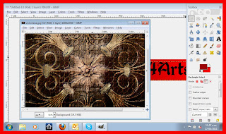
Needs something. Like a rose! A black rose. What do I have in my image library that I can use?

It's not a black rose, but it's seriously kick azz!
It's also far too big.
First step, scale the image.
I'm keeping the proportions, just scaling the width to 760 pixels. I can crop the image later.
Changing the aspect ratio works for some things, but always keep in mind it will distort the image. The bigger the change, the more distortion.
Then, using the select tool, I selected a rectangle that was 100 pixels high. This is why I typically have the rulers showing.
And then drag the rectangle to select the part of the image I want. (Sorry this is so hard to see, I'll have to keep this in mind if I do something like this again.)
Control-C to copy. Always use keyboard shortcut keys.
Now, going back to my banner. Under the Layer drop down, I select "Previous Layer." That would be the layer under the text. The one with the gradient.
Control-V to paste.
Can't read what it says? Wait for it.
Adjust the hue, saturation, and lightness of the layer in the color menu.
Until it looks the way you want it to.
And the finished product on my Etsy Shop.
It's still not as much as I'd like, but it's a start. I'm sure to play around with it the more I go. And of course, it will have to change for the holidays!


No comments:
Post a Comment